|
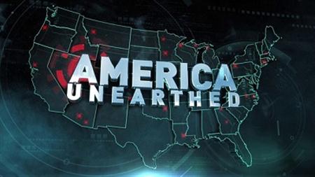
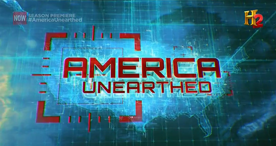
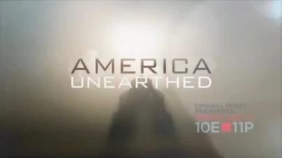
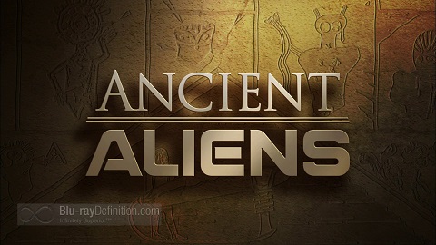
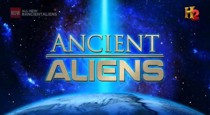
Since SPLICE, the effects studio working with Committee Films on America Unearthed, put out a press release yesterday acknowledging what I’ve known confidentially for months, I guess I’m free to tell you that H2 has hired Committee Films to produce a new documentary series on ancient mythology called Monsters, Myths & Legends, which will examine the history and evolution of monster stories and ancient mythology, probing their deep origins. If this seems a lot like Clash of Gods, the similarities are almost certainly intentional. Given that my most recent book, Jason and the Argonauts through the Ages, sought much the same information, I suppose I’ll have plenty to say about the series when it airs, and I’ll probably disagree with most of what they have to say. If you’ve read my book, you know I disagree with many of the theories about the origins of particular myths, particularly psychosexual ones. It should probably surprise no one that I wasn’t among those asked to participate in the series. SPLICE is the company responsible for the graphics package featured on America Unearthed, and I think it would be interesting to take a moment to look at how the title cards for America Unearthed and Ancient Aliens have evolved from the early to late periods. I’m very interested in the role aesthetics play in shaping perceptions, and this exercise might help us to point to how the visuals used on the shows set the stage for emphasizing certain priorities. The original title card for America Unearthed features a teal outline map of America festooned with red dots marking ancient (or pseudo-ancient) sites in the United States. The show’s name is spelled out in thick, slab-like sans-serif, slightly uneven, as though shaken by an earthquake. The dominant motif, though, is circles, suggesting not just the lens of a camera but also the concentric orbits of the show’s strange ideas around its host and his obsession. What is notable, though, is what the title card lacks: It has no direct thematic or visual connection to geology or archaeology, or even to Wolter’s Templar-Holy Bloodline ideas. Instead, it could easily serve as a cable news title card. It is, in a word, generic, and as a result it places all of its emphasis on America the brightest and largest element on the screen. The new title card for America Unearthed has downgraded the map of America to a glowing background element, and it has replaced the rather sedate circles with an intense and brightly luminescent grid atop which a blood-red crosshairs pulses. The selection of a new, squarer typeface for the show’s name has the effect of making the title card looks still closer to a generic news show (it bears some resemblance to the NBC Nightly News title card, with Fox News typography), and if anything the word America is emphasized still more heavily. Once again, there is no clear relationship to geology or archaeology, and this could be the title card to virtually any show about America. The new grid motif, however, seems to imply measurement and analysis and precision—setting us up to think of what follows as scientific and technological. The red text is more visceral and, in combination with the circulating gallery of action shots that preceded it, represents an emphasis on action and adventure (albeit one the show cannot quite fulfill), in keeping with the show’s gradual evolution from a nutty quest for Jesus’ holy genes to a nutty quest with heavy equipment, outdoor vehicles, and heroic depictions of the host braving the elements. Overall, I would rate the America Unearthed graphics as beautiful but inappropriate because they don’t visually communicate to the viewer what the show is about. Instead, they convey a misleading message that trades on the association of the news with credibility and trustworthiness to lend visual weight to Wolter’s lighter than air theories. It’s probably telling that H2, different from other shows, does not draw on elements of the America Unearthed graphics package in its advertising but instead created a completely different visual identity for the show in its advertising, one dominated by muted earth tones and the silhouette of a pyramid emerging from swirling clouds. They wanted to emphasize ancient mysteries, while the show itself wants to convey a message of news-making action. Contrast this with the title card for Ancient Aliens, which is, in its way, brilliant. The logo for the Ancient Aliens brand is a near-perfect summation of the show’s theme. The word Ancient is set in Trajan, a typeface modeled on ancient Roman carvings, suggesting timelessness and antiquity. The word Aliens is, by contrast, cast in a science-fiction-influenced typeface reminiscent of NASA’s famous “worm” logo. Together, the contrast between the ancient and the modern sums up the appeal of the show: space age aliens in prehistory. The title card is made to resemble rock inscribed with hieroglyphs, suggesting a dimly lit tomb. The carvings are modeled on genuine ancient art and show cross-cultural images of beings asserted to be aliens. It perfectly encapsulates the content of the show and its approach. In its middle period, the show experimented with a number of different title cards before finally settling on a new title card that has been used consistently for several dozen episodes. The new title card features a bright blue tractor beam blasting into the earth, set against a field of stars. While not as evocative as the original title card, the new graphic design accurately reflects the show’s gradual shift away from an emphasis on ancient sites and objects toward a greater emphasis on supernatural and mystical elements, particularly the repeated refrain that communion with extraterrestrials will lead to the transmission of an individual’s eternal soul to a heaven-like other planet or dimension. What it lacks now, of course, is the “ancient” half of the equation; the design leaves us stranded in space, the earthly cares far below us, not unlike the ancient astronaut theorists whose ideas are so far beyond mortal concerns that they need not concern themselves with such niceties as “facts” or “accuracy.”
Neither show, though, does as good a job of marrying aesthetics to content as the ghost hunting shows do. They have it comparatively easy, however, since they can draw on well-established clichés dating back to the days of Gothic horror—vacant buildings, deep shadows, the suggestion of ruin and terror. Even when the shows are themselves incompetent, they can make use of such imagery to give false power to what are, essentially, shows about grown men running around in the dark scaring themselves silly. Even the Syfy channel—home to so many ghost shows—has begun to realize that the audience for paranormal television has an upper limit, and it was interesting to learn that the network has finally recognized that fringe programming is no longer a growth field, as Syfy’s head of original programming, Bill McGoldrick, told Entertainment Weekly recently: "We had a long run with paranormal shows like Ghost Hunters and Paranormal Witness. Our audience really rejects those derivative filler reality shows. We have to work harder with smart producers to give them a different flavor of reality TV." Or maybe there’s just too much of it. Ghost hunting shows had their heyday around 2006 or so, when networks including A&E, Biography, Discovery, Lifetime, Syfy, TLC, Travel, WE, and more offered such fare. Today, more than three-quarters of ghost hunting shows have been cancelled. Instead, the shows have moved, in large measure, further up the dial, where the diminished core viewership continues to enjoy them on more obscure channels like Destination America and Lifetime Movie Network, the latter of which now airs The Haunting of…, a former Biography Channel program focused on celebrities’ ghost stories, though with the twist of having a psychic medium on hand to connect celebrities with their favorite ghosts. Have you ever seen that show? I hadn’t until this weekend when, bored and waiting for America Unearthed to start, I caught an episode in which alleged psychic medium Kim Russo met with Jesse Metcalfe, who starred on Desperate Housewives and the recent Dallas revival, to help him come to terms with supernatural experiences he claims to have had in his childhood home circa 1990. These involved being afraid of going down in the basement because it was spooky. Russo appeared to use a combination of hot and cold reading techniques (the nice thing about celebrities is that so much of their lives is easy to look up), and at no time did she or the production crew do even cursory research to substantiate her claims that Metcalfe’s childhood home had played host to the various dead people and murder victims she claimed were doing battle within, with a protective spirit holding off a malevolent entity to keep Metcalfe safe. (She was giving a pretty close summary of the 2005 Supernatural episode “Home.”) For his part, Metcalfe seemed to be trying hard to play along but could only bring himself to say that this experience with the supernatural and ghosts was “fun” rather than real or cathartic. I’d love to know what he thought about it after the cameras were turned off. What struck me though was how little the medium seemed to care about the supposed supernatural mysteries she was uncovering; instead, she focused on probing Metcalfe’s family history and trying to get Metcalfe and his stepfather to express their love for one another on camera. “It’s therapeutic,” Russo said of her psychic efforts, and it was rather evident that the appeal of such programs has less to do with the ghosts—who never actually show up—than with watching celebrities go through an impromptu therapy session with a manipulative and incompetent therapist. I wonder if the emphasis on relationships and emotions is why ghost and psychic shows have an overwhelmingly female audience. To tie this back in to where I started, I do want to point out that The Haunting of… made generally excellent use of Gothic clichés, from the title card with its suitably spooky appearance, to the dark and shadowy photography—really, there isn’t any reason not to turn on the lights. Given that this is a cheap reality show designed as a vehicle to promote Russo and various celebrities, the show made relatively great use of the aesthetics of the Gothic. It’s just a shame that it’s in service of such miserable crap.
3 Comments
spookyparadigm
11/11/2014 07:16:28 am
I would love to see a history of "big board" aesthetics, the representation of strategic map information in films and television. The practice of a big performance area moving map goes back IRL at least to WWII, if not earlier, with the unit blocks/flags pushed around maps, or the glass vertical charts on the bridge of warships.
Reply
EP
11/12/2014 11:08:03 am
Have you read Tristram Shandy? Uncle Toby's re-enactments basically involve treating the lawn as a "big board" of sorts.
Reply
CHV
11/12/2014 01:38:15 pm
I enjoy CLASH OF THE GODS a lot - mostly, because the show admits up front that it's content is mythological as opposed to dressing up mythology as quasi-fact like so many other HISTORY shows.
Reply
Leave a Reply. |
AuthorI am an author and researcher focusing on pop culture, science, and history. Bylines: New Republic, Esquire, Slate, etc. There's more about me in the About Jason tab. Newsletters
Enter your email below to subscribe to my newsletter for updates on my latest projects, blog posts, and activities, and subscribe to Culture & Curiosities, my Substack newsletter.
Categories
All
Terms & ConditionsPlease read all applicable terms and conditions before posting a comment on this blog. Posting a comment constitutes your agreement to abide by the terms and conditions linked herein.
Archives
July 2024
|
- Home
- Blog
- Books
-
Articles
-
Newsletter
>
- Television Reviews >
- Book Reviews
- Galleries >
- Videos
-
Collection: Ancient Alien Fraud
>
- Chariots of the Gods at 50
- Secret History of Ancient Astronauts
- Of Atlantis and Aliens
- Aliens and Ancient Texts
- Profiles in Ancient Astronautics >
- Blunders in the Sky
- The Case of the False Quotes
- Alternative Authors' Quote Fraud
- David Childress & the Aliens
- Faking Ancient Art in Uzbekistan
- Intimations of Persecution
- Zecharia Sitchin's World
- Jesus' Alien Ancestors?
- Extraterrestrial Evolution?
- Collection: Skeptic Magazine >
- Collection: Ancient History >
- Collection: The Lovecraft Legacy >
- Collection: UFOs >
- Scholomance: The Devil's School
- Prehistory of Chupacabra
- The Templars, the Holy Grail, & Henry Sinclair
- Magicians of the Gods Review
- The Curse of the Pharaohs
- The Antediluvian Pyramid Myth
- Whitewashing American Prehistory
- James Dean's Cursed Porsche
-
Newsletter
>
-
The Library
-
Ancient Mysteries
>
-
Ancient Texts
>
- Mesopotamian Texts >
-
Egyptian Texts
>
- The Shipwrecked Sailor
- Dream Stela of Thutmose IV
- The Papyrus of Ani
- Classical Accounts of the Pyramids
- Inventory Stela
- Manetho
- Eratosthenes' King List
- The Story of Setna
- Leon of Pella
- Diodorus on Egyptian History
- On Isis and Osiris
- Famine Stela
- Old Egyptian Chronicle
- The Book of Sothis
- Horapollo
- Al-Maqrizi's King List
- Teshub and the Dragon
- Hermetica >
- Hesiod's Theogony
- Periplus of Hanno
- Ctesias' Indica
- Sanchuniathon
- Sima Qian
- Syncellus's Enoch Fragments
- The Book of Enoch
- Slavonic Enoch
- Sepher Yetzirah
- Tacitus' Germania
- De Dea Syria
- Aelian's Various Histories
- Julius Africanus' Chronography
- Eusebius' Chronicle
- Chinese Accounts of Rome
- Ancient Chinese Automaton
- The Orphic Argonautica
- Fragments of Panodorus
- Annianus on the Watchers
- The Watchers and Antediluvian Wisdom
-
Medieval Texts
>
- Medieval Legends of Ancient Egypt >
- The Hunt for Noah's Ark
- Isidore of Seville
- Book of Liang: Fusang
- Agobard on Magonia
- Book of Thousands
- Voyage of Saint Brendan
- Power of Art and of Nature
- Travels of Sir John Mandeville
- Yazidi Revelation and Black Book
- Al-Biruni on the Great Flood
- Voyage of the Zeno Brothers
- The Kensington Runestone (Hoax)
- Islamic Discovery of America
- The Aztec Creation Myth
-
Lost Civilizations
>
-
Atlantis
>
- Plato's Atlantis Dialogues >
- Fragments on Atlantis
- Panchaea: The Other Atlantis
- Eumalos on Atlantis (Hoax)
- Gómara on Atlantis
- Sardinia and Atlantis
- Santorini and Atlantis
- The Mound Builders and Atlantis
- Donnelly's Atlantis
- Atlantis in Morocco
- Atlantis and the Sea Peoples
- W. Scott-Elliot >
- The Lost Atlantis
- Atlantis in Africa
- How I Found Atlantis (Hoax)
- Termier on Atlantis
- The Critias and Minoan Crete
- Rebuttal to Termier
- Further Responses to Termier
- Flinders Petrie on Atlantis
- Amazing New Light (Hoax)
- Lost Cities >
- OOPARTs
- Oronteus Finaeus Antarctica Map
- Caucasians in Panama
- Jefferson's Excavation
- Fictitious Discoveries in America
- Against Diffusionism
- Tunnels Under Peru
- The Parahyba Inscription (Hoax)
- Mound Builders
- Gunung Padang
- Tales of Enchanted Islands
- The 1907 Ancient World Map Hoax
- The 1909 Grand Canyon Hoax
- The Interglacial Period
- Solving Oak Island
-
Atlantis
>
- Religious Conspiracies >
-
Giants in the Earth
>
-
Fossil Origins of Myths
>
- Fossil Teeth and Bones of Elephants
- Fossil Elephants
- Fossil Bones of Teutobochus
- Fossil Mammoths and Giants
- Giants' Bones Dug Out of the Earth
- Fossils and the Supernatural
- Fossils, Myth, and Pseudo-History
- Man During the Stone Age
- Fossil Bones and Giants
- Mastodon, Mammoth, and Man
- American Elephant Myths
- The Mammoth and the Flood
- Fossils and Myth
- Fossil Origin of the Cyclops
- History of Paleontology
- Fragments on Giants
- Manichaean Book of Giants
- Geoffrey on British Giants
- Alfonso X's Hermetic History of Giants
- Boccaccio and the Fossil 'Giant'
- Book of Howth
- Purchas His Pilgrimage
- Edmond Temple's 1827 Giant Investigation
- The Giants of Sardinia
- Giants and the Sons of God
- The Magnetism of Evil
- Tertiary Giants
- Smithsonian Giant Reports
- Early American Giants
- The Giant of Coahuila
- Jewish Encyclopedia on Giants
- Index of Giants
- Newspaper Accounts of Giants
- Lanier's A Book of Giants
-
Fossil Origins of Myths
>
-
Science and History
>
- Halley on Noah's Comet
- The Newport Tower
- Iron: The Stone from Heaven
- Ararat and the Ark
- Pyramid Facts and Fancies
- Argonauts before Homer
- The Deluge
- Crown Prince Rudolf on the Pyramids
- Old Mythology in New Apparel
- Blavatsky on Dinosaurs
- Teddy Roosevelt on Bigfoot
- Devil Worship in France
- Maspero's Review of Akhbar al-zaman
- The Holy Grail as Lucifer's Crown Jewel
- The Mutinous Sea
- The Rock Wall of Rockwall
- Fabulous Zoology
- The Origins of Talos
- Mexican Mythology
- Chinese Pyramids
- Maqrizi's Names of the Pharaohs
-
Extreme History
>
- Roman Empire Hoax
- American Antiquities
- American Cataclysms
- England, the Remnant of Judah
- Historical Chronology of the Mexicans
- Maspero on the Predynastic Sphinx
- Vestiges of the Mayas
- Ragnarok: The Age of Fire and Gravel
- Origins of the Egyptian People
- The Secret Doctrine >
- Phoenicians in America
- The Electric Ark
- Traces of European Influence
- Prince Henry Sinclair
- Pyramid Prophecies
- Templars of Ancient Mexico
- Chronology and the "Riddle of the Sphinx"
- The Faith of Ancient Egypt
- Remarkable Discoveries Within the Sphinx (Hoax)
- Spirit of the Hour in Archaeology
- Book of the Damned
- Great Pyramid As Noah's Ark
- Richard Shaver's Proofs
-
Ancient Texts
>
-
Alien Encounters
>
-
US Government Ancient Astronaut Files
>
- Fortean Society and Columbus
- Inquiry into Shaver and Palmer
- The Skyfort Document
- Whirling Wheels
- Denver Ancient Astronaut Lecture
- Soviet Search for Lemuria
- Visitors from Outer Space
- Unidentified Flying Objects (Abstract)
- "Flying Saucers"? They're a Myth
- UFO Hypothesis Survival Questions
- Air Force Academy UFO Textbook
- The Condon Report on Ancient Astronauts
- Atlantis Discovery Telegrams
- Ancient Astronaut Society Telegram
- Noah's Ark Cables
- The Von Daniken Letter
- CIA Psychic Probe of Ancient Mars
- Scott Wolter Lawsuit
- UFOs in Ancient China
- CIA Report on Noah's Ark
- CIA Noah's Ark Memos
- Congressional Ancient Aliens Testimony
- Ancient Astronaut and Nibiru Email
- Congressional Ancient Mars Hearing
- House UFO Hearing
- Ancient Extraterrestrials >
- A Message from Mars
- Saucer Mystery Solved?
- Orville Wright on UFOs
- Interdimensional Flying Saucers
- Poltergeist UFOs
- Flying Saucers Are Real
- Report on UFOs
-
US Government Ancient Astronaut Files
>
-
The Supernatural
>
- The Devils of Loudun
- Sublime and Beautiful
- Voltaire on Vampires
- Demonology and Witchcraft
- Thaumaturgia
- Bulgarian Vampires
- Religion and Evolution
- Transylvanian Superstitions
- Defining a Zombie
- Dread of the Supernatural
- Vampires
- Werewolves and Vampires and Ghouls
- Science and Fairy Stories
- The Cursed Car
-
Classic Fiction
>
- Lucian's True History
- Some Words with a Mummy
- The Coming Race
- King Solomon's Mines
- An Inhabitant of Carcosa
- The Xipéhuz
- Lot No. 249
- The Novel of the Black Seal
- The Island of Doctor Moreau
- Pharaoh's Curse
- Edison's Conquest of Mars
- The Lost Continent
- Count Magnus
- The Mysterious Stranger
- The Wendigo
- Sredni Vashtar
- The Lost World
- The Red One
- H. P. Lovecraft >
- The Skeptical Poltergeist
- The Corpse on the Grating
- The Second Satellite
- Queen of the Black Coast
- A Martian Odyssey
- Classic Genre Movies
-
Miscellaneous Documents
>
- The Balloon-Hoax
- A Problem in Greek Ethics
- The Migration of Symbols
- The Gospel of Intensity
- De Profundis
- The Life and Death of Crown Prince Rudolf
- The Bathtub Hoax
- Crown Prince Rudolf's Letters
- Position of Viking Women
- Employment of Homosexuals
- James Dean's Scrapbook
- James Dean's Love Letters
- The Amazing James Dean Hoax!
- James Dean, The Human Ashtray
- Free Classic Pseudohistory eBooks
-
Ancient Mysteries
>
- About Jason
- Search
© 2010-2024 Jason Colavito. All rights reserved.




 RSS Feed
